← The Library
An event poster on a cream background with a visible grid structure.

Unknown

An event poster built on a visible grid, mixing bold black condensed type ("Kenji Takimi," "Kito Jempere") with a hand-drawn line illustration of Mount Fuji on a solid red panel, Japanese katakana in a boxed outline, and scattered white circles as graphic accents.

itsnicethat.com

Credit

Creator
Dima Shiryaev
Found via
It's Nice That

Clipped

danysegv

August 25, 2026

Traits

Movement

NeoSwissInternational Typographic Style

Grid-locked rationalism in the Swiss lineage — objective type, mathematical division, and restraint held as a position rather than an absence.

Typography

ChoppyTypeType Collage

Blending multiple fonts and fragmented arrangements to create instant visual energy and mimic physical zines.

Palette & Light

HighEnergyHyper-Saturation

High-saturation, unexpected hues injecting playful personality and warmth into clean geometric spaces.

Layout

ExposedGridModular Grid

Visible column structure and strict modular division, where the grid is left exposed as the composition rather than concealed as a scaffold.

RawAsymmetryAsymmetry

Irregular, off-balance column breaks and floating elements mimicking imperfect physical zines.

Treatment

CleanDigitalUntreated Surface

Vector-clean, unmediated surface — flat fills, crisp edges, and even light, with no grain, halation, dust, or process residue anywhere in the image.

Medium

PosterWorkPoster / Out-of-Home

Single-surface display work built to be read at distance — bills, gig posters, and out-of-home placements.

Subject

TypeOnlyText as Image

Lettering carrying the image alone, with no photographic or illustrative subject beneath it.

Shares traits with

Ranked by how many traits each reference has in common with this one — computed from the image, never from who is looking at it.
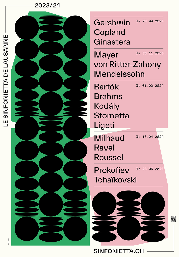
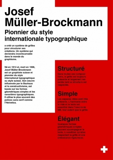
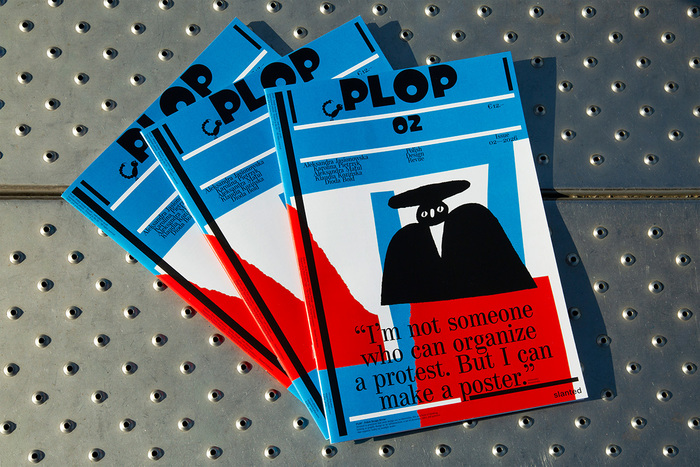
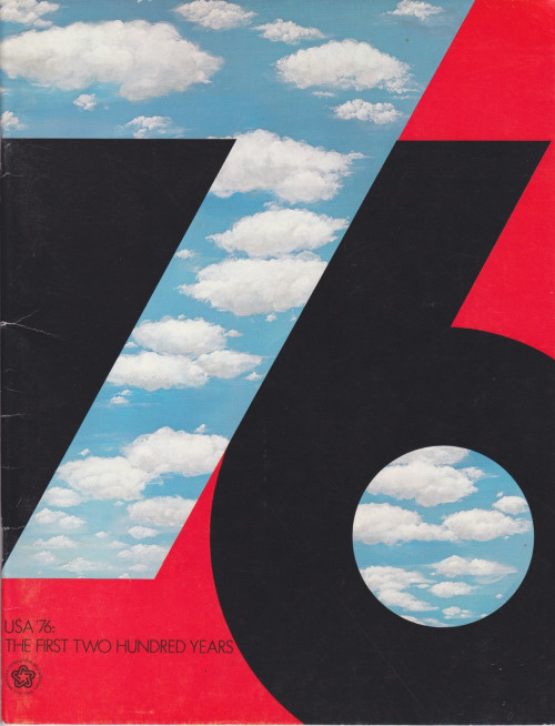
A two-panel exhibition poster for a design archive and presentation, printed in black and yellow typography on grey paper.Open book spread showing editorial design with bilingual typography and layout.A poster for a classical music season programme featuring a bold geometric grid of black circles and horizontal lines on a bright green left panel, with a pink right panel listing composer names and event dates in a sans-serif typeface.A poster for Josef Müller-Brockmann featuring bold black sans-serif typography on a split red and white background.A poster for a 25-year anniversary event features massive black condensed sans-serif letterforms spelling out text, cropped and stacked to bleed off the edges against a solid yellow background.Business card design featuring bright acid-green background with black typography and circular letter elements.Bold graphic poster for a London event featuring thick, condensed sans-serif type in pink and black with neon red background.Stack of four copies of PLOP #02, a Polish design revue magazine with bright blue covers featuring white horizontal stripes and black typography.Book cover featuring a large typographic "76" numeral in black and red with negative space revealing a photograph of blue sky and white clouds.A dark grey campaign visual for Yeezy Season 1 featuring a close-up photograph of a model wearing oversized draped grey knitwear.Three orange booklets fanned out, featuring white condensed sans-serif typography reading 'Archive of Hesitations' with black spine binding.A graphic identity design split into four color-blocked quadrants showing the title