Le Metronum Visual System
Branding Design: Le Metronum Visual System by Brand Brothers
abduzeedo.com
Credit
- Creator
- Brand Brothers
- Rights
- Le Metronum
- Year
- 2022
- Found via
- Abduzeedo.com
Clipped
September 15, 2026
Traits
Movement
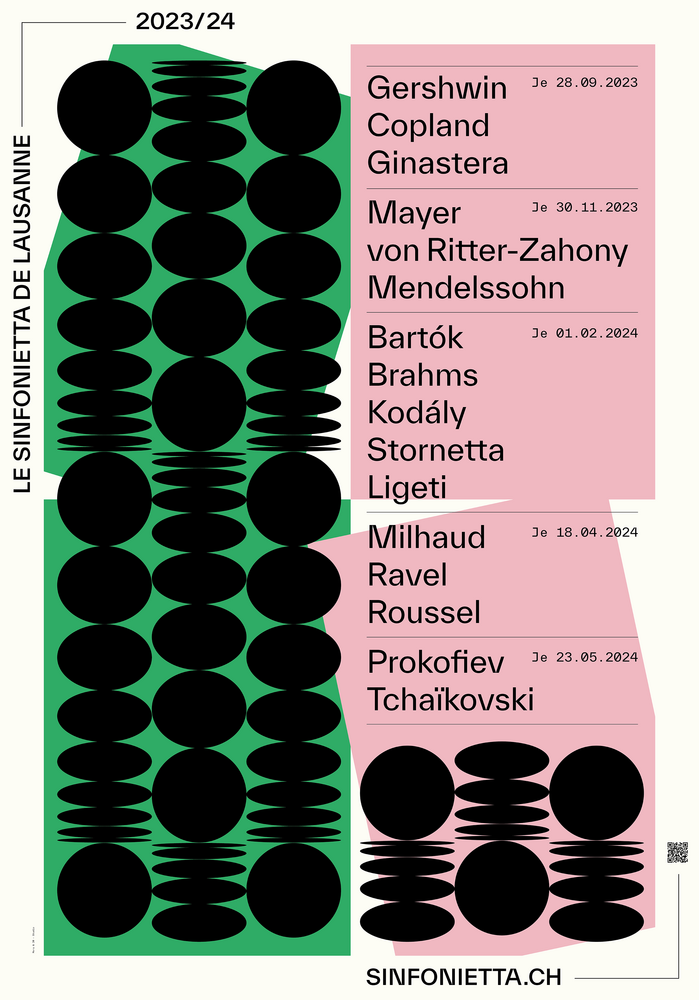
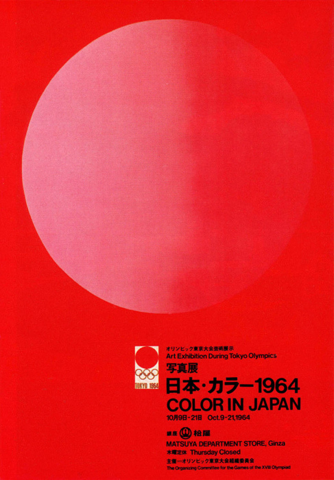
Grid-locked rationalism in the Swiss lineage — objective type, mathematical division, and restraint held as a position rather than an absence.
Typography
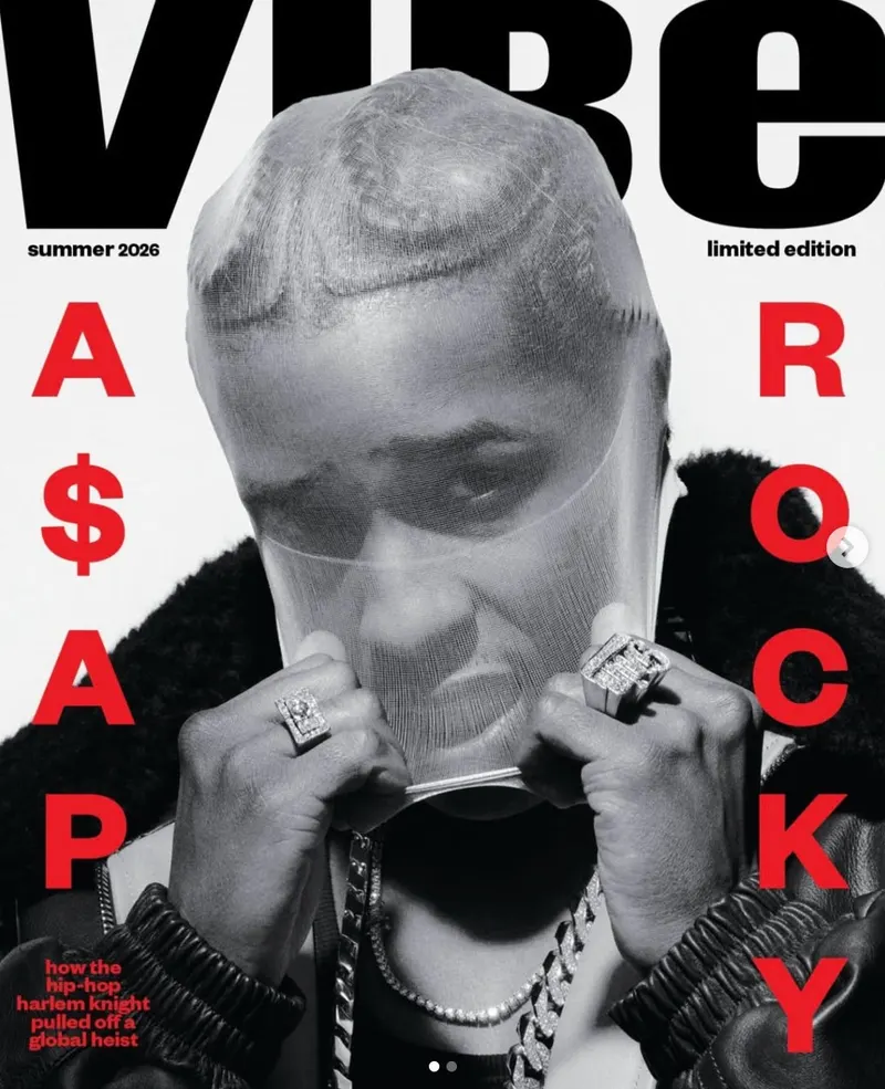
Thick, intentional lettering providing necessary structural weight to modern minimalist layouts.
Palette & Light
High-saturation, unexpected hues injecting playful personality and warmth into clean geometric spaces.
Layout
Subjects severed at the frame edge — faces, objects, and letterforms cut hard rather than contained, using the crop itself as a compositional act.
Treatment
Vector-clean, unmediated surface — flat fills, crisp edges, and even light, with no grain, halation, dust, or process residue anywhere in the image.
Medium
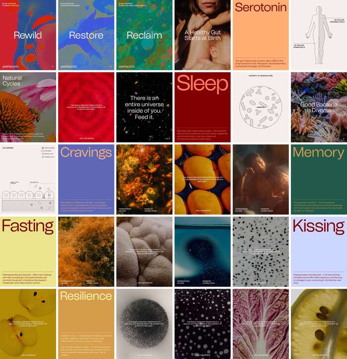
Multiple applications of a single identity shown together in one frame — marks, palettes, and typographic rules laid out as a system rather than as one artifact.
Subject
Colour, texture, and form resolving to nothing depictive — pattern and field rather than picture.
Shares traits with
Ranked by how many traits each reference has in common with this one — computed from the image, never from who is looking at it.